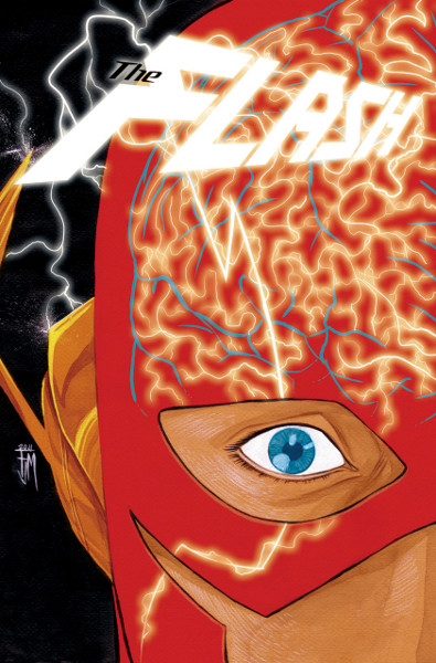
Francis Manapul has been posting his art process for The Flash #2 on his Tumblr blog, starting with layouts, moving to the finished drawing, to the finished cover…which you may notice includes the logo!
Here is the finished cover to The Flash #2. I colored the cover in Photoshop. I color my cover on occasion when there is a very specific look I’m going for. This was also the first time I got to play around with the title logo. I wanted to run the electricity on it to make it look like it’s part of the art. Had a lot of fun on this cover.
I’m not sure why, but it makes me think of the Tangent Comics Flash logo…even though it doesn’t look remotely like it. If anything, it’s slightly reminiscent of the design used for All-Star Superman and All-Star Batman & Robin, but even then, only barely. Check out my run-down of the Flash logos throughout the years. It looks like I’m going to be updating it again soon…


Looks a lot like Wally’s, minus a few serifs.
I don’t see it. IMO, it looks more like the flying hot dogs minus the hot dogs.
Okay, a bit. But Wally’s had the same triangle-shaped cuts and it was slanted the same way…
Looks cool….can’t wait for #1!!!!
I think it looks very very good!!
You’re right Kelson, it DOES look a bit like the hot dog logo!!
The Flash font is reminiscent of the FURY OF FIRESTORM font they’re planning to use. Check it:
http://firestormfan.com/2011/06/21/firestorm-logos/