Today’s guest post is the fifth in a series of interviews by Greg Elias on The Art of Speed.
Since the launch of the latest ongoing Flash series last summer, artist Francis Manapul has illustrated some of the most elaborate speed sequences in the character’s history. Teamed with Writer/DC Chief Creative Officer Geoff Johns and colorist Brian Buccellato, Manapul came to the Flash title following runs on Legion of Super-Heroes and Adventure Comics, as well as two issues of Superman/Batman. His work is instantly recognizable: deceptively simple and atmospheric, at once well-suited to the tone of Johns’ Flash stories and unlike any artist to previously work on the title. Together with Johns, he has set the pace for a renewed Central City and the feel of this Flash book.
With his first six issues, The Dastardly Death of the Rogues, collected for release on February 15, Manapul is set to begin his next chapter on February 9 with Flash #9. This story is billed as a lead-in to the upcoming Flashpoint event, and features the debut of Hot Pursuit, a new speedster first revealed in the final pages of Flash #6.
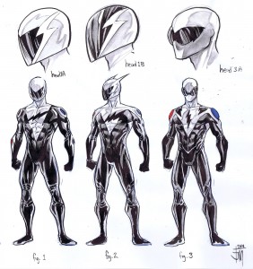
We spoke with the Manapul via email, where he revealed some of the building blocks for his Flash, including super-speed innovations and previously unseen designs for Hot Pursuit!
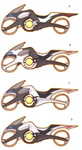
Q: Were you in charge of the redesigns of the Rogues’ style for the Renegades’ uniforms, and the look of the upcoming Hot Pursuit? What’s it like getting to put your stamp on these decades-old characters, and also introducing new characters who are being written into Flash lore? Also, what goes into imagining the Renegades’ upgraded technology?
FRANCIS MANAPUL: Yeah, it was great fun designing a future version of the Rogues. I’m a big fan of simplicity of designs which is what makes the DC Icons work so well. I tried to keep their costumes as simple as possible and keeping the same feel as the originals. Their new tech is pretty much the same as the originals just a bit altered. Hot Pursuit was a tough one, creating a new speedster is never easy. Again I tried to keep it as simple as possible to keep the same feel as the rest of the speedsters. I spent more time designing his motorcycle more than anything else.
Q: The Dastardly Death of the Rogues was high on action, with the Renegades in constant pursuit of Flash, and battling their inspiration in issue #5.
How does a sequence like that title page spread in issue #5 come together?
Did you look back at any previous Flash vs. Rogues books when building these scenes?
FM: The spread in issue 5 was a really tough one to crack. I actually redrew that page numerous times. There were certain points in the script that I wanted to make sure was in there and that’s what made it tough, I was adamant about making sure I left nothing out. I didn’t really get a chance to look at previous battles, for reference. Like I said my focus is always translating as much of Geoff’s vision on paper as I can and that usually means coming up with new ways to portray the action.
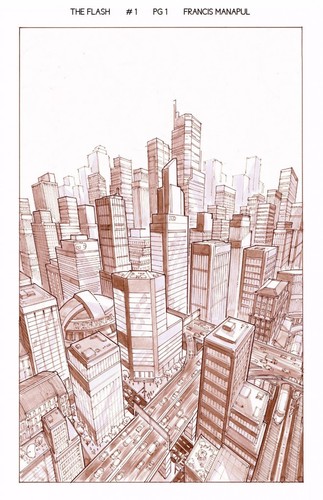
Q: What goes into defining Central City, since it has made only occasional appearances in the pages of Flash over the last 20+ years? The idea of a “city on the move” was explicitly stated and visualized on the first page of the first issue.
How about the architecture and Flash’s interaction with the environment? Is there a specific skyline that you keep in mind?
FM: Before we started the book Geoff had a very specific idea of what the city was like. It just so happens that the city he wanted me to base it on was my hometown of Toronto. He really liked the sleek lines of the Toronto skyline but peppered throughout is a few historical buildings but mostly new. He wanted the city clean, fresh, and ALWAYS on the go. With its residents always rushing to be somewhere, and wanting to do things quicker. Little details like the abundance of “Jitters” coffee shop all over the city helps drive home that the city is very fast. It’s almost a contrast to Barry Allen himself who is slow and methodical when it comes to his forensic work, but the city itself almost directly reflects the Flash. If you look at some of the billboards, I always make sure to include signs of telecommunications always offering faster services. I feel that the citizens of Central City feel that everything could be faster and better. And the background reflects that I think.
Q: What do you consider when designing a city of the future, like the images of Central City in the 25th Century?
FM: Having worked on the Legion of Super-Heroes, I was accustomed to drawing futuristic cities. I just try to keep it even more sleek and clean. I wished there was more to say, but I honestly just go with the flow on that one.
Q: There were a number of “big” speed tricks in this story, such as
- Flash reconstructing an apartment building
- Flash taking apart an airborne car
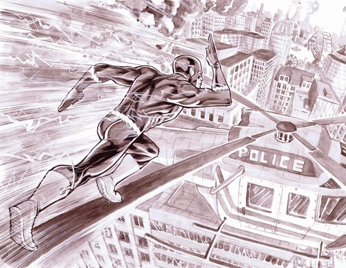
- Flash running on the blades of an out-of-control helicopter
What goes into the construction of these super-speed action scenes? With regards to the helicopter scene, was it tough to keep track of the timing of it all?
For instance, you have the pilot and co-pilot suspended in time while Flash performs the rescue in “real-time”, but the readers’ perspective on the passage of time changes from panel to panel.
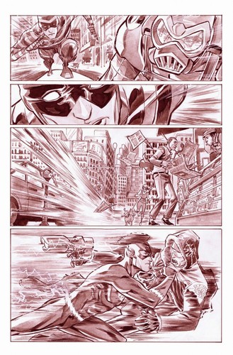
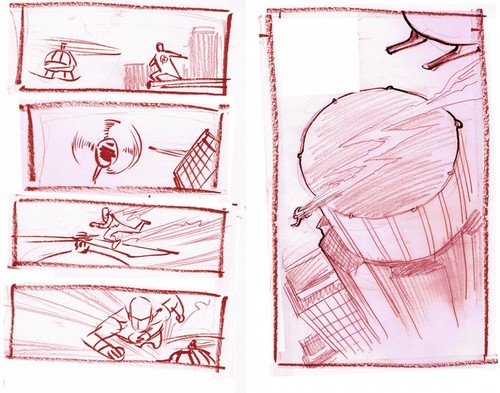 FM: This is my favorite part of working on this book. From the get go, we set a goal for ourselves in the first arc that Barry is going to do one “speed trick” that hasn’t been done before. It was really important to show his speed not only using visual effects but also situational effects. It adds much more impact when you have a point of reference showing just how fast The Flash can go.
Before we started the series Geoff expressed this desire and told me to throw some ideas his way. That’s how the helicopter scene evolved. I sent him this idea for a scene not knowing how he was going to incorporate it into the story, but that’s what’s so great about working with Geoff. He finds ways to include some of your ideas seamlessly with his. I had almost forgotten about it until I read the script, and I was amped to see it there!
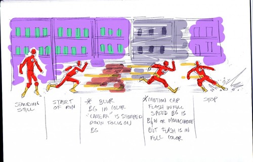
The airborne car was completely Geoff’s idea much like most of the situations are. I’m blown away every time I read a new issue and he continued to surprise me with every new one. Some of the other effects that we used were the idea of suspended time. I thought it would be a great effect that when the time is “frozen” all of the Flash’s surrounding have a very muted, monochromatic colors except for him.
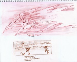
I also created a “speed color chart” for Brian to run with. Basically similar to action photography, when the subject is in focus the background will be out of focus, and vice versa. There was no reason why we couldn’t use color or lack thereof to also put that extra emphasize on the speed effect. I feel like I can go on and on about this, and we hope to show even more new stuff in future issues. We want to continue to innovate.

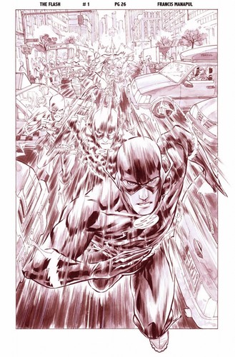
Toronto is my hometown too, so I’m personally quite delighted to see it as the base of Central City’s design. Manapul puts in actual buildings and street references every so often, as well as at least one store named after a real business.
Cameron Stewart, who drew the Captain Cold/Keystone story in the Catwoman series, is also from Toronto and put in a real-life TO building too. It seems that the Flatiron Building is in both Central AND Keystone! 🙂
Well, you see, every time there’s a crisis, the Flatiron Building’s history is altered so that it was built in a different city. It really makes getting to work confusing! 😀
Man, life in the DCU must really suck 😀
This post is literally dripping with awesome sauce! I especially enjoyed seeing the unused designs for Hot Pursuit and his bike. I love seeing unused character designs. Great insights into design elements also. Especially the cities. One thing that Geoff gets more than anything else is his settings.
very nice! thanks!
Fantastic article!!
I have completely enjoyed Manapul’s art since he started on Flash. For a person like me who is a die hard Wally fan, the artwork alone has been a major factor in sucking me into Barry’s world. Keep up the awesome work Francis!
Great article! I have been loving Francis’ take on the Flash. He really puts a lot of effort into making the speed effects look awesome! He absolutely deserves to not only be nominated for the Shuster Award, but to win it!
This interview is a real treat and full of nice behind the scenes stuff. That color chart for the speed effects is cool.
I am curious what will be going on in the main Flash title while Flashpoint is being published. Will Manapul draw those issues? How will it tie into Flashpoint?
Have they revealed who Hot Pursuit is yet? I haven’t picked up an issue of the Flash in awhile.
If they haven’t revealed him yet, I have a theory… I believe Hot Pursuit is Prof. Zoom’s brother Robbern (perhaps from a different Earth where Eobard didn’t erase his existence, or perhaps someone like Waverider un-did his removal from existence without Eobard realizing it).
No, the story starts next week.
Great interview — and that helicopter page was probably my favorite panel of last year’s comics!
Great interview, but too short just like the Flash books are! 🙂 I demand more! I love the fact that they’re consciously thinking of ways for the speed to impact the story. The trick in Issue 9 was really great and well thought of, though I won’t spoil it.