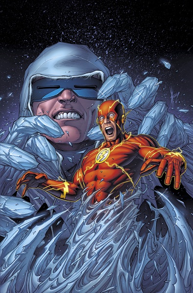
The Source has unveiled Dale Keown’s variant cover for The Flash #7. They also hint that there’s more behind Captain Cold’s rampage than was revealed last issue.
On the art process:
“I was sent a few sentences about the story and an existing cover to get started,” Keown told THE SOURCE when asked about his creative process. “I worked up a sketch for editorial, which was approved with some notes. I usually do the digital inks with some gray scale rendering so it’s just a matter of throwing on some color and hi-lites.”
The Flash #7 concludes the two-part Captain Cold story, and races into stores on March 28.


The first thing that grabbed me about the cover: “What brand of tooth whitener is Cold using?”
No. Seriously. I never saw such a perfect pair of pearly whites.
awesome! Bolland-esque.
Eh. I don’t like how overly muscled Barry looks. His left shoulder just looks weird.
That chin strap really has to go.
At least that thing doesn’t look nearly as bad as it does in Justice League #6. I saw the scan for the award ceremony pages…. Oy. Is Barry’s jaw that breakable that he needs such bumper guard glued to it?
Let’s hope that Jay of Earth-2 doesn’t sport one.
Oh goodness…that just sprouted in my brain, that did. Please, DC, no straps on Jay’s helmet!
Did I call it or what?
Still shuddering. It’s worse than even I imagined.
Nice looking cover.
Shame Keown can’t keep a monthly schedule. He does some really nice stuff.
I’m kinda warming up to this new Cold~
(Ha! XD)
I really like that this cover is darker than the original. I’ve been looking at the previous Flash covers and it seems as though they use a lot of white. The original is difficult to look at almost. The only thing is The Flash. I like the way The Flash looks in the original. That is a big deal though. This cover has a simplicity to it that the original doesn’t have. I’m torn