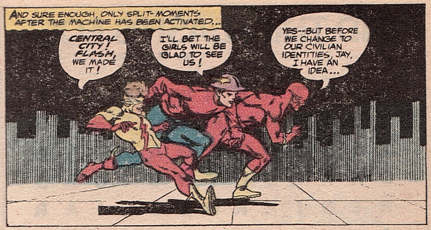
Flash #173, the full-length “Doomward Flight of the Flashes,” is an all-time classic tale of the DC multiverse by legendary writer John Broome and the great Carmine Infantino. Featuring the three Flashes of the time in a dimension-leaping epic, this is pure Silver Age Flash in the Julius Schwartz tradition! While reading a copy of the 1980 DC Blue Ribbon Digest #2, I was inspired by a panel on the final page, showing the three Flashes arriving back on Earth One:
The position of the figures in space and their different centers of gravity, as well as the solid city backdrop, give this a strange sense of motion fitting a return-trip from an alternate reality. It is deceptively simple and effective, and spurred me to pull a reprint. That’s where things got a little weird…
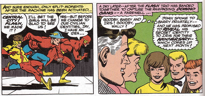
Here’s the same panel, as it appears in Crisis on Multiple Earths: The Team Ups, Vol. 2:
This was the first instance of a layout change in a reprint that I could recall. In an era where nearly every DC Comics monthly is getting the collected-edition treatment, it is not unusual to see changes to the original stories in the reprinted versions. From major crossovers like Crises both Infinite and Final, to Neal Adams re-inking and re-coloring his classic DC work, liberties are often taken with intentions and results that are sometimes hard to pin down.
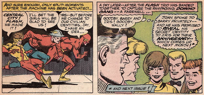
Flash #173 has been reprinted four times. With help from a fellow Flash fan, I confirmed that the page is the same in DC Comics Classics Library: The Flash of Two Worlds hardcover as it is in Crisis on Multiple Earths. This was extra-strange to discover, since I understood the DC Classics Library has gone to great lengths to alter their reproduction to preserve the original values, as with the Superman Kryptonite Nevermore storyline. However, once I pulled the original issue, the plot thickened like Cary Bates was in my apartment…
Somehow, someway they had re-worked the layout for only the Blue Ribbon Digest! I was going off of the assumption that the panel(s) had been contracted at some point recently, but the truth is they were once expanded! With this being the case, which came first? Was the page restored for the Blue Ribbon Digest? You can see where Kid Flash’s shadow is cut off, but what about Jay’s complete foot?
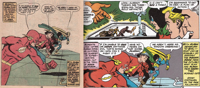
Becoming very interested to see if this was done to any other stores, I was able to immediately locate another example. Notice the difference between these two editions of a page from “The See Nothing Spells of Abra Kadabra” [Flash #170], as reprinted in DC Special Series #24 (another 1980 digest) and the same Crisis TPB (which matches the original issue):
Great Dibny’s Nose! Can you speed-readers think of any other examples where the layout on a given page has changed when reprinted? Let us know in the comments. We’re going to get to the bottom of this!
UPDATE: I reached out to Mark Waid on Twitter for help, and he replied!
@Greg_Elias Short answer—stories were often heavily reformatted for digests. Was this to make up for a 1/3 page ad in original?
— Giant Waterbear (@giantWB) May 3, 2013


wondering if Bob Rozakis or @MarkWaid can help solve this Blue Ribbon Digest Flash mystery…http://t.co/of5dIJ8u87
@Greg_Elias Short answer—stories were often heavily reformatted for digests. Was this to make up for a 1/3 page ad in original?
Thank you, Mr. Waid, for taking time out of your day to help us out on this one!
During the period Flash #173 was printed, the final story page always had an advertisement on the bottom half (previously the bottom third). As this was standard practice, it would have been drawn that way originally.
With the digest reprint, DC chose to spread the panels out to fit the full page. That’s why the three Flashes are cramped into the middle of the panel, whilst the left and right is all blank space. The word balloons in that panel are particularly sloppy – Barry’s is all wobbly, and they didn’t even bother utilising the extra space to fit the word “idea” into the first balloon, and Kid Flash’s balloon is pointing to his elbow.