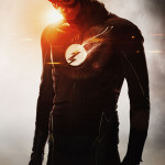
 The CW has officially released images of the new Flash costume for the second season of the show, and it looks pretty good. I guess the only real change that I can see is the white logo, which brings it a bit closer to his costume in the comics. What does everyone think of it?
Speed Force
Tracking the Flash – the Fastest Man Alive

So Vendetti and Booth changed the background of the emblem for nothing (like idiots)
The photo shopped pictures of the lighter red look soooooo much better but it does separate the TV show. I’m glad the creators seem to listen to fans at least a little.
Between the silhouette and lens flaring it’s hard to say.
If they’re not going to add decent amounts (but not crazy like the current books) of lightning accents on the arms and waist then I’d rather the circle had stayed as dull as the rest of the coloring. As it is the white pops too much compared to the rest.
(Which is not to say that I approve of the dull red and barely-there yellow piping. That’s just so mundane and tired looking compared to the 2010 Flash suit in the books.)
I think this looks great. They should have had something like this from the start. Now if only we could get the current comics to switch it back …
That ridiculous belt still has to go. It would be a liability even at 25 mph.