Top Cow’s upcoming Velocity series (focusing on Cyberforce’s speedster) has been delayed once again, with series artist ChrisCross leaving the project.
This reminds me of something I’d been meaning to post about the covers solicited for the (now canceled) first two issues:

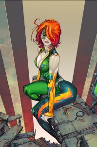
Velocity #1. Left: ChrisCross and Snakebite. Right: Kenneth Rocafort.
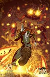
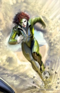
Velocity #2. Left: ChrisCross and Snakebite. Right: Stjepan Sejic
Notice which ones say “super-heroine” and which one says “swimsuit model.” Now, guess which one Top Cow was using to promote the book?
I’ve got to say, I really like the Stjepan Sejic cover for #2 and the ChrisCross cover for #1. The Rocafort cover? Frankly, I’d have been a bit embarrassed to buy it. Of course, this is Top Cow…
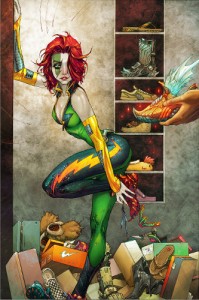
And then there’s this one, also by Rocafort, which was identified as another alternate cover to issue #1.
Sources:
- Image Solicitations for January 2009
- Image Solicitations for February 2009
- Lying in the Gutters (October 13, 2008)

Unfortunately, too many artists seem to use the internets easy access to porn as the main source for their ref…
It does seem to getting better though as here it’s only 25%. A few years back it seemed to be almost EVERY artist. At least the ones getting published.
Whether it’s comic books or beer. Thirty year old fanboys or young hormonal ones – companies know that sex sells.
Honestly, I don’t have any problem with this. Two main reasons: #1 – it’s not for kids. Of course, kids could read it I suppose, but they haven’t been comics’ main audience for decades now. If this is for 30-year-olds, they can handle some cleavage and, in fact, most likely enjoy it. Reason #2 – The Rocafort art actually looks GOOD – very stylish and well-drawn, in my opinion. Maybe it’s not for everyone, but the cool angular lines work for me and the coloring is beautiful. It looks like the artist understands anatomy and then chooses to stylistically distort it. The problem with all those bad cheesecake books in the ’90s was that some of the artists couldn’t draw, and just tried to hide behind bad T&A.
If someone picks this book up, they either get enjoyment from good art and story (if it doesn’t have good art and story, they lose, but would have lost anyway, hot babes or no) OR enjoyment because they enjoy the women OR enjoyment from both. This is a book about a hot female superhero; I don’t think anyone will buy it with the mistaken belief that it’s the Qur’an.
There was some well-deserved outrage months ago about a tentacle-filled Heroes for Hire book cover. Looking at that, it seemed unnecessarily exploitative and offensive to women. This, on the other hand, is just a well-drawn attractive superhero.
I had only heard about this book, you mentioning it, or seeing an article about in Wizard or so on. I guess I know now why I never saw it on the shelf. I don’t know if I would have gotten it, but being a fan of speedsters I probably would have. But this chrisscross, damn are those covers dynamic. If I had seen that cover to issue 1 staring at me on the shelf at my LCS, I would sure as hell have picked it up. It’s too bad he’s off. I’m sure he would have drawn speed very well.
Is it easier to get published by DC/Marvel then it is by Playboy/Hustler?
Comics are not for kids… I feel kinda sad about the fact. A kid is in my house one day and I have to be concerned that he might pick up a comic book. Comic books – NSFW!
Cleavage or Qur’an? Is it either or? No other option? Of course not. In reality the images above are TAME compared to some stuff I’ve seen in mainstream comics. It does seem to be the intent of some artists to titillate.
Porn can be be well drawn or poorly drawn and still be porn. Are the above pics porn? No, of course not. But if your ref is porn and your intent is to stimulate sexual feeling/desire within your audience – then what are you drawing?
Must be comics…
I completely agree with you about the covers. I like ChrisCross for issue #1 and Sejic for #2 (Although the second ChrissCross is interesting too).
I get that sex sells, but I would be embarassed to walk up to the counter at my comic book shop with either of the Rocafort covers. It’s not just boys buying the comics. And as a female speedster fan, I can appreciate it when female leads are drawn as sexy, but it’s nice when the artists do it without looking like the character is about to sell thier body. Egads, I get enough weiredness being one of the few females in a comic shop without bringing a comic to the counter that looks like a Maxim cover. *sigh*
Too bad it’s been canceled, it always fun to read new twists on the Speedster concept. I guess I’ll just hang onto the hope that Flash: Rebirth won’t be delayed any further. I really look forward to the idea of having a big DCU Speedster family running together again.
The main problem, IMO, isn’t the cheesecake per se, or the quality of the art — it’s that it says absolutely nothing about the character beyond the fact that she’s hot. The first Rocafort cover, especially, which might as well be a cover for Dawn without the personality. Or, as ElfGrove suggested, a copy of Maxim (which was the same magazine I thought of, which says something about either their covers or their brand recognition).
I assume Top Cow is — well, was — hoping to pull in new readers, and not just those who read the Pilot Season book or are long-time fans of Cyberforce. That means introducing the character and what she does.
Now you can surmise from the title that her stock in trade has something to do with speed — but you can’t tell from Rocafort’s first cover that she herself is fast. She could be a pilot or a driver of some sort. She could accelerate other objects (like Wally’s ability to lend speed). The alternate cover at the end is actually better, because of all the running shoes.
Compare to the first covers for the various Flash series (links to GCD):
Flash Comics #1
All-Flash #1
Showcase #4
The Flash #105
Flash v.2 #1
Flash: The Fastest Man Alive #1
Notice something in common? They all show the hero running. You can tell instantly what he does. And looking at the other Velocity covers: In ChrisCross’ cover for #1, she’s skidding to a stop with enough force to damage the pavement. In both covers for #2, she’s running full-tilt.
Edited to add: Similarly, the Pilot Season cover and the first cover from her 1995 miniseries make it clear that she’s a runner.
The Rocafort covers were at least advertised as variants (I got confused last fall when I missed the solicitations for #1, and thought that his were the only covers), though I have no idea what ratios Top Cow was planning to ship — but it doesn’t make sense to use the generic “look she’s hot” picture for the big push to launch a new book unless that’s going to be the focus of the book. (And again, this is Top Cow, so for all I know that was going to be the focus of the book.)