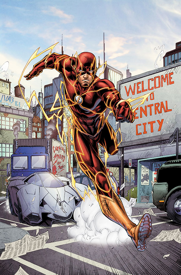
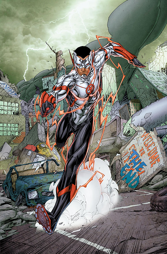
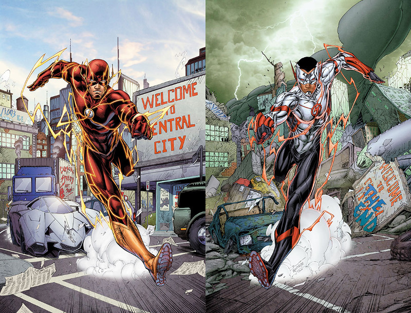
DC has revealed the remaining Future’s End covers for September’s New 52 anniversary event. These will be motion covers, like last year’s 3D covers except showing a before-and-after pair of images. The pair for the Flash issue is…well, take a look!


They’ve also confirmed that the issue will be written and drawn by the usual creative team. This should come as no surprise to those who’ve been following interviews with Robert Venditti and Van Jensen, as it fits right into the current time travel storyline.
So what do you think of the new look for Wally West?


Wow, Not-Wally looks awesome; I like how they’ve come up with a new colour for Not-Wally because otherwise the classic yellow and red would’ve really clashed unattractively with his dark skin (some colours just don’t work with different skin tones and shades).
@SpeedForceOrg I get the “red lightning” stylistically, but I see that more as #ReverseFlash… Yeah, #nitpicky.
The red lightning is very telling.
Interesting It kind of has shades of Booth’s Wally West designs from a few years back which shouldn’t be surprising since Booth likely created this too.
I like it. It’s reminiscent of New 52 Kid Flash but tweeked a bit. Can’t wait to see him in action.
I’m glad that Wally’s getting powers sooner rather than later. I don’t think the costume’s terrible, but they really needed to add some gold into the design. A little would have gone a long way (even if it was only an eye color to replace the evil red eyes he currently has). I’m a bit disappointed he isn’t retaining the future Blue look, though. Wonder if he’ll be Kid Flash or just “Flash.”
Wally was never the future blue Flash. That was Barry.
I know. There was speculation that he’d inherit it somehow.
I’ll buy the action figure either way.
DC is intent trying new things. Unfortunately they’re BAD new things.
Do they even THINK BEFORE putting something out anymore?
Do not want.
The open head top is silly to me. I don’t understand why that’s open.
The three color scheme wouldn’t bug me but the lack of black up top and lack of silver on the bottom ruin it. It feels like two characters.
It is likely open as a callback to the Kid Flash design which almost always featured an open head.
This is too painful. I want the real Wally West.
Shouldn’t this be chromium instead of lenticular?
The race of Wally isn’t the issue. It’s the way he’s being portrayed. He is not Wally. Barry is just barely Barry (not a fan of the dead mother tragic origin). But I can’t read New 52 Flash without being letdown or angered.
well it was sarcastic. I could see the writing on the wall once Detective West was cast for the TV show. We wanted our comics to be mainstream for years but its a double edged sword and once it gets there it gets all the politics and pettiness and “helpful suggests” that we didn’t have to deal with before.
A bit busy, too much clutter on the arms/hands and torso for my liking. I think it would look sleeker if it stuck to just two colours, or at least downplayed the third.
It does make me very curious as to what will happen with the 12 year old Wally.
I love this look. And I don’t give a fuck that he’s black now, I don’t think it was ever an important part of his character to be white.
I don’t mind it. It is in line with the ‘busier’ designs a few characters got with the 52 reboot.
It’s reminding me of Bart’s suits (both DC52 and when he first became Kid Flash in the old universe.) That’s not a compliment, btw.
I give up. This Not-Wally is just NOT Wally to me. He’s another speedster whose usurped the name or by sheer astronomical coincidence shares the exact first/second/last name as Wally R. West. The costume is too heavy looking especially at the arms. Looks like a cross between Cyborg and Kid Flash.
If it was still just Barry, I’d probably have gone back to buying the trades. If this had been a new character…okay.
Having this Not-Wally staring back at me?
No. That’s going to hurt too damn much and that’s before shelling out $20-something for hardbound.
Kyer continues to pass on DC52 books and animation alike.
I’m with you Kyer, I am still incredibly unhappy with this Wally. If it were some other Earth then I could be interested, but it’s not. This is DC’s new Wally West and I hate it on top of everything else I hate about the New 52. I don’t read any DC anymore save for Sinestro. And because this is the New 52 these are the kinds of things we can expect to see in The Flash when he hits the big screen and that disappoints me even more. I hate you now DC.
If I have learned anything from observing Booths approach to another kid flash it is that this design will not be the last. This isn’t the Kid Flash or Wally West I grew up with, but then again what is more authentic a story teller that presents us with something old or … something different?
The silver is a nice addition, I like that.
But the open cowl look is redundant here though. For that look to succeed, the character needs long hair to be whistling in the wind as he/she runs. It looks strange on NuWally.
I agree, the open cowl looks ridiculous
Given Booth’s comments in the Flash podcast about how he really wasn’t excited to be writing Wally since he was just a kid and not a really superhero, I don’t think this version of him will stick around in any significant way. It’s probably just for the DC event. Then Wally will go back to being 12 years old and not a superhero.
I like that cover with the Flash on it. Not sure who that is on the other cover and I’m not terribly interested
What I think is sad is… I think I’d really like this character if his name wasn’t Wally West