DC’s June solicitations are starting to roll out, including…
THE FLASH #41
Written by ROBERT VENDITTI and VAN JENSEN
Art and cover by BRETT BOOTH and NORM RAPMUND
THE JOKER Variant cover by EDDY BARROWS
On sale JUNE 24 • 32 pg, FC, $3.99 US • RATED T
Professor Zoom is back, and he’s not alone! Who’s along for the ride to kill the fastest man alive? Find out here!
Interesting, considering that Reverse-Flash Daniel West is out and about in the relaunched Suicide Squad.
Also, what do you think of the adjustments to the costume?
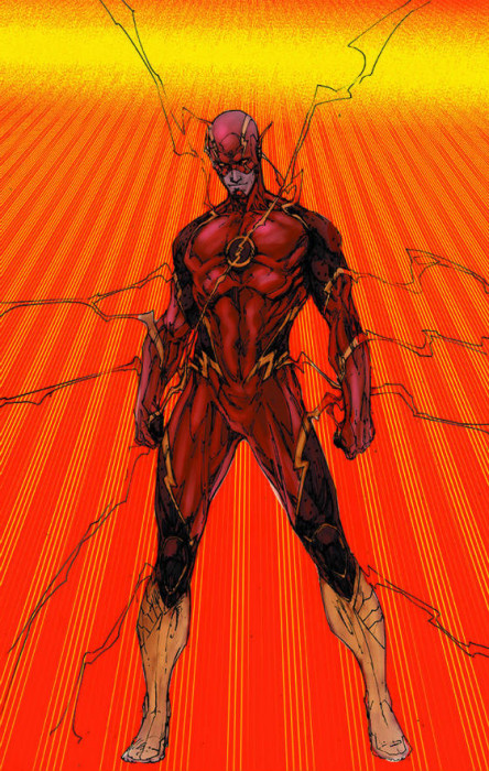
Update: Artist Brett Booth tweets that this isn’t the issue’s cover, but the costume design drawing.
That’s not the actual cover, that’s the costume design image I did for the new costume. Sorry about the colors, it’s been awhile.
— Brett Booth➕➕ (@Demonpuppy) March 12, 2015
Also: A scan of some of the interior pencils showing the Flash in action with the new costume.
Found one! Shot of the new suit in action! pic.twitter.com/clz2xB7K8n
— Brett Booth➕➕ (@Demonpuppy) March 12, 2015
Suit looks sick! Though it looks like Bart could pull it off better 😛
I think Eddie Thawne is the other guy… Cobalt Blue.
I would like it if Eddie, after a bad break up with Iris and jealousy of the Flash, gets a funky blue crystal from some gypsies that were passing the night of the particle accelerator explosion….
I love this costume but the emblem is yellow and red. I’m not opposed to it but it’ll take a little while to get used to rather than the yellow and white.
I dunno. It’s okayish. I don’t care for the art though.
Wait, did I miss something? Is that Barry or Eobard?
So….looks like Flash got bumped up to a $3.99 comic, which probably means I’m out. I cannot justify to myself to buy a comic for that price. Maybe I’ll pick them up in the back issue bins at a convention down the line.
I don’t like the way the thighs are cut in half diagonally, it looks awkward and inelegant. I’m not sure what purpose it’s supposed to serve aesthetically – it would look a lot better if the the lightning strip separating the two textures ran down the length of the leg, similar to the previous costume and the TV show. Like this: http://static.comicvine.com/uploads/original/0/40/2815144-fls_cv19_qsx0pxzxj7.jpeg
Hopefully it’ll look somewhat better in the book, with a more professional colouring job.
It changed.
Uh….my first impressions are that the dark on the thighs for some reason make me think of cowboy chaps. The second is that I miss the lighter background on the chest icon.
Are the arm lightning accents only on the upper arms or also on the lower? I can’t tell. Prefer the lower….never liked upper arm accents even on the alter-Flashes in Elseworlds and Chained Lightning. Darkness on upper torso makes it look like a sport shirt. Also not a look I care for.
On a scale of one to 10 I’m pretty much in the middle or a bit lower. Going to give it a view viewings to see if it grows on me.
Honestly, I need to see it without the ribbony lightning around the figure. Can’t tell what’s part of the costume and what’s just Speed Force.
The sport shirt remark reminds me: I’ve noticed people wearing a style of shirt where the torso and sleeves are black and the shoulders are a solid color, or vice versa. Especially if someone’s wearing black pants with it, it always reminds me of either a Starfleet or Green Lantern uniform.
Sorry, I’m confused. Is that new costume for Zoom, or Barry? And wasn’t Daniel West specifically Reverse Flash and not Zoom (both villains have the specific differences)? So is this Zoom a new guy? Or Hunter Zolomon post-convergence?
I would assume this is either the original Thawne or a post-Flashpoint version of him. He was name-dropped in the first half of the Future Flash storyline.
Frankly, I’m more excited about Professor Zoom finally making his New 52 debut. Maybe some #Flashpoint references? http://t.co/9VWUd670e5
Personally I think it’s more complex than it needs to be, at least for the comics page, but that’s a matter of taste. I seem to recall Brett Booth saying he likes very detailed art, so I can see the appeal.
Given the complexity, I like that it keeps the color scheme for the most part, keeping the two main tones as different shades of red. (Black might work, but it would start looking too much like the Daniel West Reverse Flash costume). Though I hope they decide to make the emblem circle white again by the time it reaches print.
Literally every time they have tried to improve on the overall classic Carmine Infantino perfect Flash design they have only detracted from it. I see that continues here. Will we ever see the real DC characters again? I’m talking the real costumes and characters, REAL Wally West and REAL Barry Allen (my favorite Flash) without the murdered mum origin. Cool as a one off story where Barry fixes it in the end, but not as his “official”one; Geoff Johns took the symbol of the Silver Age and turned him into everything wrong with the Modern Age, then destroyed the DCU and blamed it on Barry and Thawne. He’s practicality negated all the good he ever did on GL back in the day with all this crap now. Barry was one of the few heroes who didn’t have tragedy/death in his origin. They’ve lost something unique with him with this.
You’ll have to wait a whole month.
http://www.newsarama.com/23239-dc-s-full-april-2015-solicits-convergence.html
Truer words, man. Truer words….
Johns, like a certain balding mustached individual blights everything he touches out of sheer cliches
Is the “real” Wally the one with the perfect Norman Rockwell family that fell to pieces when he was an adult, or the one who grew up in a dysfunctional home from the beginning?
Either is good as long as it’s not New 52. I prefer the “perfect Norman Rockwell family”, as you sneeringly put it, to the dysfunctional home from the beginning, personally, even though I grew up with the Waid version, but I would prefer either to what we have now.
Don’t look now but Geoff Johns has decided that Wally West is Kid Flash and all Kid Flashes will be DC52 version. Also the TV show was the basis for Wally being turned….not!Wally. Like I’d kind of guessed that.
Anyway, they keep managing to turn me off more and more of the remaining chunks of what had been my favorite comic book fandom to the point that I’m seriously considering just throwing in the towel for all the dickery against original Wally fans. It’s like….Linda…how can we mess up Linda for the TV show? Now Wally himself. That’ll make ’em stew. *insert evil cackle*. Geez Louise, making half wish I’d never tuned into Justice League that fateful day back in 2008.
Thus, why I refuse to watch the CW show. I won’t be a accomplice in the further desolation of Wally West at the hands of a hack who (and DiDio) need to wake up and realize Julie Schwartz, Carmine Infantino and Alex Toth are not coming back from the dead to thank him for butchering their legacy.
Yeah…I’m just going to keep praying to Jack Kirby for a new creative team and keep not buying until someone grants my wish.
Really? Zoom? We just had a long Flash vs. Flash arc that started only a few months after a Flash vs. Reverse Flash arc!
And BRETT BOOTH…urrrrrrrgggggg…brett booth.
Don’t get me started on Brett Booth
I side with Dietz here.
Obviously not the actual cover. So what happened to the Pandora plot point at the end of Flashpoint?
Don’t like it at all. The Infantino design was perfect the way it was. Still hate the chin strap too.
Don’t like it. Sorry, but the Flash has one of those costumes where everytime someone tries to tweak it, it always looks worse. The New 52 design was overly busy, and this one looks even more so.
K.I.S.S (Keep It Simple Stupid) really does seem to apply to the Flash.
If you’re going to change the suit. Do it COMPLETELY.
The Walter West design was extremely cool. Different colour scheme, different logo, but still instantly recognisable.
This one looks like the car crash Bar Torr thing from Teen Titans….
Disagree. The changes made when Wally got his own costume improved the look. The belt became more dynamic.
Giving The Flash suit Barry’s TV show style “belt” or waist lightning trim when Wally wore it is hardly comparable to that abomination above. That suit was still the same overall Carmine Infantino design just with the “belt” that met at the center. That’s nothing like this crap or little puzzle lines and armor all over it.
It doesn’t look too bad, I think a better picture that’s clearer might make it look better.
But I wish he would have went down the same route when he designed Wally’s 52 costume (which I thought was pretty awesome) By taking various designs from previous Flash’s and combining it into something new and great.
I really dont want the emblem red in the background and I love the show but I want the shows Flash to lookmore like the comic not the other way around. Really,it’s my only gripe about the show and appeapprantely now the comic.
I like it. But I suspect that it will revert back to the original incarnation when Booth is off the book.
As long as they don’t mess with the cowl, I’m happy.
I am not excited to see Zoom at all, especially for a buck more. Quite sick of multiple speedsters and even the speed force. It seems that is all writers can do, speed force, multiple Flashes, then again and once in awhile toss in Grodd. All that DC has been able to do with the Flash is divide the fan base so no way 100% will like who is in the dang suit. Sad to say but DC is offering too many better books at 2.99 to justify this one. So Flash bumped for Midnighter.