 ZOOM is back…and creating all sorts of havoc in the lives of the Allens. Yes, I mean plural…but the connection between Zoom and you-know-who isn’t clear quite yet (or if you don’t-know-who, check after the jump). What we DO know is that Barry (and others) are making some very tough moral choices, and each one of those choices appears to be setting the stage for significant repercussions. With that in mind, let’s get to the review, shall we?
SOME SPOILERS AFTER THE JUMP!
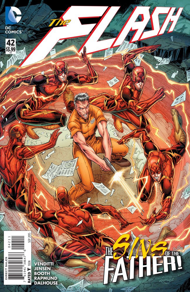
Henry Allen escaped from Iron Heights last issue, but Barry refuses to believe his father is anything but a victim in the breakout. While he tries to get in on the crime scene, Iris West shows up. They talk about Patty, about Wally, and about what the police think of The Flash…and not all of that discussion is positive. Meanwhile…
Henry and his fellow escapees are at a medical supply warehouse, when Zoom intervenes. We see just how fast Zoom can be as he travels almost between thoughts, setting Henry up for even more serious charges than a mere escape. It appears there is a history between them, based on Zoom’s comments while he sets Henry up for…you’ll need to read the issue for more on that. Next, we see The Flash tracking down both Girder (great action sequence here) and the insider who helped the prisoners escape. Barry learns of his father’s role in the escape…and makes a choice about this insider as well…
…before running into Zoom again! Zoom is obviously taunting Barry, and leads him to a location…that I won’t spoil here, but it raises the stakes even further.
There are no easy moral choices in this issue – not for Barry and not for a host of other characters. Bad times are coming, and compromise seems the order of the day, even if those compromises are difficult. Robert Venditti and Van Jensen are giving us a Barry Allen who is watching his world fall apart, and I don’t think Barry has hit bottom yet. This makes for a powerful story, and Venditti and Jansen are truly hitting their stride with this arc.
There’s plenty of action as well, with exceptional artwork by Brett Booth, Norm Rapmund and Andrew Dalhouse. I especially liked those scenes where Zoom is running between moments, setting the stage for even more havoc – those scenes were handled masterfully.
SUMMARY: The reintroduction of Zoom is making a HUGE impact, and this is well worth a second and even third look. There are a lot of significant moments for Barry, Henry Allen and more…and plenty of excellent action as well. If you have been on the sidelines lately, NOW is the time to get back on board with THE FLASH.
I know this comes across as minor, but this is the reintroduction of *Professor* Zoom.
This was pretty good for an issue that was putting pieces into place. There was some good character development.
Not super into Booth’s art. Iris’s hair just looks crazy. And people’s bodies and faces just look very elongated vertically. It’s just not for me.
Oh, and something I hate: When the Flash — this Flash or any other Flash — gets hit by by foe that the Flash is looking directly at. Girder never should’ve been able to hit Barry that first time at Grams’s house.
This is the worst Flash issue I’ve read in years and I still don’t know how you keep giving this creative team glowing reviews, especially Booth’s art. It’s disastrous. His poses are stretched out, anatomical disasters and any character who isn’t in the foreground gets all the attention of someone doing finger paint. And that’s not even an overexaggeration, go look at the first page Iris shows up on (the one before she first talks, when she first enters the scene) she’s literally no better than a 3 year old trying to draw a person with fingerpaint.
As far as the characters, I can’t stand this thing they’ve been pushing since Forever Evil with the city hating The Flash, that’s so counter intuitive to the more positive character The Flash is supposed to represent. I also can’t believe that, apparently the biggest takeaway they got about Wally from the older books they said they read was that…his passion is cars. Talk about completely screwing up there. Iris being this stereotypical aggressive reporter crap is also annoying, she seems happy so long as some disaster or some atrocity is happening as long as her name’s on the story.
I don’t know, I can’t stand it and I really don’t know what they’d have to do to get a bad review on this site.
Regarding your last sentence: It’s a review. Reviews are opinions. Ed’s opinions on the issue differ from yours.
Differences of opinion are great. They make discussions interesting. But casting aspersions as to whether the other person’s opinion is *valid*? That’s not necessary.
I get the idea that it’s a different opinion, but you can’t just hide behind that idea when you’re commending art that churns stuff like this out:
http://imgur.com/FOinSjh
It brings into question what their opinion really represents. I get that people disagree with me on things but when you’re lauding the absolutely lazy and ugly art that was in this book it feels like it’s just a repetitive echo chamber. He’s just saying it’s good to say it’s good instead of being even slightly critical about the problems with the book.
There are choices to be made in the artwork of every comic, some for artistic reasons and others for practical reasons. It is also important to note the difference in viewing a comic in print and digitally. The picture used as an example is in the far background of one panel on an otherwise very detailed page. Take a look at the digital effects being used to enhance Barry’s speed, check out the stubble on Barry’s face and the detail in his hair just two panels prior to the one being used as an example of “fingerpainting”. For that matter, check out the new uniforms for both Flash and Professor Zoom being drawn throughout the issue. There is a lot of detail throughout the issue, with a style that I happen to appreciate. As for background images rendered in much less detail, you are correct that some of those images are in far less detail.
In some cases, the varying levels of detail are used for artistic reasons, like the focus of a camera, to draw our attention to the part of the panel the creative team wishes to emphasize. In other cases, it may be due to time…that the rest of the page and the rest of the book take enough detail work that backgrounds get less detail in order to have a book out on time. However, there is one more thing to consider here.
That picture used as an example is not easily noticed in print. It shows up as a much bigger issue when viewed digitally, especially if you use a panel-by-panel view on comiXology. Keep in mind that while print comics are produced much smaller than the original Bristol boards on which they were drawn, clicking on the zoom-in feature digitally can actually make that image larger than the original sketch. That means that some items that frankly aren’t very big on the original sketch now show up at a size where you may wonder, “why didn’t that get more attention?” I get the concern, but that image and others like it simply did not detract from the overall artwork to me.
I have been a fan of Brett Booth’s work for some time, and I stand by my reviews. Booth is an excellent artist in my opinion, and the overall work he and Norm Rapmund and Andrew Dalhouse put into THE FLASH works for me. If you disagree, that’s your right. My reviews are simply my own opinion…whether anyone agrees with me or not, I’m okay. I stand by my opinion.
When someone says “I like this,” there’s a world of difference between saying “I don’t” and “You’re wrong.” David, you’ve crossed that line repeatedly in the comments that have posted and those still in the mod queue, and have already been warned. I think you should sit this one out.
To clarify: There is a difference between “I disagree because of X, Y, and Z” and repeatedly insisting “I don’t think you really believe what you’re saying.”
ugghhhh, Girder…
*shakes head in disgust
Why does Barry not remember Thawne? Is grinders hair metallic? Not a huge fan of Grinder but the bread look is sweet.
I’m definitely looking forward to someone else doing the art.
I most definitely miss Manapul and Buccellato’s art.
The writing over the course of Jensen and Venditti’s run has been mediocre. Blue Flash was almost a complete retread of Dark Flash.
I like the art on the book. I tend to think that most of the complaints regarding Booth’s artwork is very similar to the complaints I’ve seen hurled at other 90’s era super stars. I frankly don’t mind the art work. But I think Booth is better at drawing men than women. The writing though is just aweful, can’t we get Abnette on the tittle?