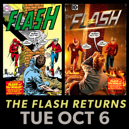
CW has released the first photo of Teddy Sears as Jay Garrick – in the ever-classic style of a “Flash of Two Worlds” homage cover!
The image was released at the Television Critics Association’s semi-annual press tour.
Who else is excited to see Jay Garrick coming to TV? What do you think of his live-action look?
High-res image via The Flash Podcast.
Update: DC’s site talks a little about Flash #123 (Carmine Infantino & Gardner Fox) and its legacy as the book that introduced the multiverse to DC Comics.


I cannot wait for October!!!
I really, really, really wish they’d fill in the lightning bolt. The yellow outline alone doesn’t read very well.
Otherwise, good job!
That was my reaction too. Can’t figure it out the reason. The boots, yeah, update those suckers, but the shirt?
Did they run out of yellow dye?
Yeah, I’d prefer that too. It makes me wonder if they tried it and found it didn’t quite work on screen, or if they’re doing the same “let’s not have too much contrast” thing that I think was behind the red circle on Barry’s outfit for season one.
Otherwise, though… I’m just excited that this is an actual, real thing!
Yassssssss!!!!!!!!!!!!!!!!!
Also, a case of weird timing:
Last night I dreamed that I was visiting my parents and went to my old regular comic store, and the show was filming a sparring match between Barry and Jay in front of the store. In the dream I got to meet both actors during a break, and tried to take a photo with them, but the camera wouldn’t work.
It’s kind of funny that the *actual* first view of the costume would hit the next day!
Love it, thanks for the heads up!
I’m just throwing this out there, but the “victim” in the image, given her blonde hair and what looks like a CCPD patch, could this be the first image of Patty as well?
The more I compare the two images the more I think the original falling beam was much more dramatic than the place-is-on-fire setting. The peril is more impending. He needs to be saved Like Right NOW while she has some minutes to spare for pleasantries.
(I’m just noting that the original artwork was genius.)
The new image isn’t great. The body positions for both Barry and Jay are wrong. People don’t run with their left arm and left leg forward. It’s a major pet peeve.
The classic cover, fortunately, got it right 🙂
i was just thinking the same thing
Looks great and I can’t wait 😀
This is the best thing Ever! Wohooo!!!
Jay is my Favorite, so it’s great to see what he actually looks like. Miss the solid yellow lightning bolt symbol, but the outline is ok, overall his suit has an old timey feeling to it. which is ok, I do like the gloves on him to.
Can’t wait till october!
[img]http://s26.postimg.org/n4iuzr6s9/CW_Jay_Garrick_Flash_Approval.gif[/img]
How cool is it that there’s a show on TV that does stuff like this?
Yeah Arrow is alright, but the Flash TV writers really are embracing everything that’s great about the book and it’s history.
Arrow is now starting to come around to embrace more of the DCU comicbook universe, but for a long time it was hedging their bets.
Roll on Earth 2!