Salutations Speed Readers,
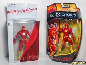
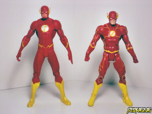
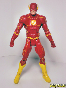
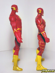
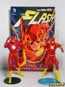
So now that DC Comic’s own in-house collectibles company, DC Collectibles and the owners of the master DC Comics toy license, Mattel have both released their own version of the New 52’s Scarlet Speedster we finally get a chance to look at both and compare and contrast:
One of the first key differences to note when it comes to these figures is that each one seems to be inspired by a different artist. The DC Collectibles version definitely looks to take it’s visual cues from the New 52 Justice League comic book and Jim Lee’s art from that series. Jim tends to use the electric seams much less visually and there are many times in the Justice League book where Flash is moving at super speed and nothing seems to be lighting up at all. I’m going to interpret it as him having to go a certain speed in order for the seams to start pulsing with electricity. There are also noticeable differences when it comes to the chin strap and the cowl wings. Jim has a rounded yet detailed look to his chin strap and went with ultra-sleek aerodynamic wings that look like they are slicing through the air.
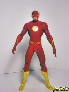
As far as the figure itself it is 7 inches and features the same basic articulation that nearly all DC Collectibles’ releases do. Unfortunately the face sculpt on a number of these figures has come out looking fairly derpy. Something to do with the eyes being painted oddly I’d imagine. I actually think the second one that I have pictured here is a lot better than my first one. They did however do an excellent job on the armored boots and raised chest symbol. The paint on my second figure was also much better than the first featuring no chipped paint and some pretty clean paint apps when it comes to the lightning. I think the best part about this figure is that they went the extra mile and actually sculpted the lightning seams into the suit. Sure they aren’t painted yellow but they are freaking sculpted in. That is awesome. I managed to pick up a few extras so maybe I will end up painting them in on one of them. Overall though I think this is a solid figure that I’m digging more each passing day. Easily the best Barry Allen figure we’ve seen from DC Collectibles/DC Direct in ages.
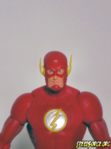
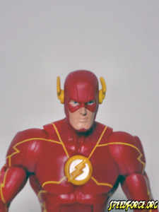
Francis Manapul’s stellar artwork on the latest Flash series was undoubtedly the inspiration for Mattel’s updated Flash figure. Not only is Francis Manapul’s cover to The Flash #1 brilliantly reproduced on the front of the package the figure shares of lot of the same details and is just about perfect when it comes to capturing the likeness. For those not in the know Mattel has released about five (or six if you count the beefy All-Star release) versions of Barry Allen in the DC Universe Classics line and this one definitely beats the pants off of the rest. No matter if you hate or love the new look there is no denying that Mattel definitely took these figures a step further. The detailed sculpted lines on the cowl, the raised emblem and the armored boots are all completely new sculpted pieces and add a whole new dimension to these suits. Since it seems like they were using the art from The Flash #1 for their references it makes since that they would include the electric seams lighting up which is what the yellow lightning lines are supposed to represent. I personally wish they would have went a little further and sculpted the lines like DC Collectibles but overall still a really good figure and one of my current faves. I will note that there was a slight bit of paint missing from the emblem on my first version of this figure. The second doesn’t seem to have that problem. So look carefully at paint apps if you have a chance.
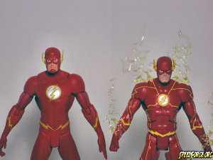
You can see the differences in the cowl wings here. The DC Collectibles’ version is definitely sharper and more aerodynamic.
The verdict? It really comes down to several factors when deciding which figure is right for you (or your loved ones):
DC Collectibles New 52 Flash:
- Based on comics legend and current DC Comics Publisher, Jim Lee’s art from the best-selling, New 52 Justice League series and sculpted by Jack Mathews.
- Made more for collectors than children. The figure is not only less durable than regular figures but this one in particular features some pointy cowl wings that have a high potential to break off and be swallowed or poke someone.
- Limited articulation. Basically you aren’t going to be getting more than a few generic poses out of this guy without being pretty creative.
- Also sold in a 7 pack with the rest of the New 52 League making it easier to collect all of the members of the team in one fell swoop.
Mattel’s DC Unlimited New 52 Flash
- Based on the art of Francis Manapul, Co-Writer and Artist of the New 52 Flash series and sculpted by Mattel’s frequent collaborators, The Four Horsemen.
- Features lots of articulation allowing for a large amount of poses.
- Includes snap on lightning accessories which could possibly pose a small choking hazard. The wings however are sturdier and more rounded towards the end making them less likely to break off or poke you.
- While the yellow lightning lines might look a little cheesy to collectors, kids really go for stuff like this.
I’m a huge fan of both but I must give the edge to the DC Collectibles New 52 Flash. You just have to appreciate the detail that went into this figure, especially the sculpted lightning seams. Stuff like that is what puts the figure over the top. Sure the face is a bit wonky but I can live with it. Sometimes I wish for more articulation and then I remember History of the DC Universe (DC Collectibles’ past failed attempt at full articulation) and I cringe. Although I am posing my characters more often I find it a bit more fun and challenging to try and get good poses out of less articulated figures sometimes.
So what do you all think? DC Collectibles’ New 52 Flash inspired by Jim Lee or Mattel’s DC Unlimited New 52 Flash inspired by Francis Manapul? Let us know in the comments below!
Thanks for reading,

I’m usually all for the DC Collectibles versions, but the Mattel Flash was a far better figure hands down.
To each their own, sir. I really wish they would have attempted something different with the lightning seams on the Mattel version or just left them off entirely. Batman and Superman get all their lines sculpted on but Flash gets the shaft with cheesy looking painted on yellow lines.
I’m with you about the seams, but it’s the face on the DC Collectibles one that kills it for me. The rest of the figure looks great, but it’s so goofy looking.
I know Justin! Literally goofy! He’s cross-eyed! Lol
Good review, thanks Devin! 🙂
I definitely agree on the face but I’m looking at the figure as a whole. Plus those sculpted seams.
Great review though, I always look forward to them.
The DC Direct is better on everything, chin strap, body chest icon, carved lines, antennae….except for the eyes. The eyes on the Mattel have a better ratio of iris/pupil to white and that little dot of ‘lighting’ that adds charm. As eyes are extremely important to me. So I vote….
that I can’t wait for my ArtFX to arrive.
Sorry, DC & Mattel, you both blew it with me. Pity you can’t switch heads.
Something to note: some of the sculpts in the 7-pack are different than the individuals. Wonder Woman and Cyborg have weapons in one and Superman’s head looks more squarish in the other. Here again I’d go with Artfx sculptures. The idea of woman warriors prancing about in a bikini bottom just always struck me as weird and impractical. (Thank god she isn’t wearing high heels.) NuCyborg looks like he belongs in a Transformers movie. The chain on Arthur’s trident….that thing makes me laugh and not in a good way. Like his mother put it on so he wouldn’t loose the thing. Yeah, I get that this is precisely why it is there, but it still looks stewpid. 😀
Anyway, nice review, Devin.
On a second look at DC’s…I know what it is…the rounded chin cowl makes his jowls look fatter. Plus that look on his face… Maybe he’s eyeballing Diana in that bikini bottom?
I like the DCC version much better as well. The mattel version’s lines look so tacky and why didn’t they color the lines on the cowl? Why attempt to put attention to detail if you’re not going to complete it? The picture on the box clearly shows that the cowl lines do “light up”. It’s too bad the DCC version didn’t keep the original head sculpt that it had on the prototype versions that made their way to various conventions.
both are ugly. gimme the old super powers version that got the costume right!
I have the DC Collectibles version. I think it looks so much better. It really is for the collector. The Mattel version just looks to childish for me.