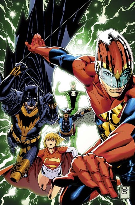
CBR has the solicitation and cover for the post-Convergence debut of Earth 2: Society.
EARTH 2: SOCIETY #1
Written by DANIEL WILSON
Art and cover by JORGE JIMENEZ
1:25 Variant cover by PAULO SIQUEIRA
On sale JUNE 10 • 32 pg, FC, $2.99 US • RATED T
The survivors of Earth-2’s war with Apokolips find themselves on a new world, but can Green Lantern, Power Girl, a new Batman and the other heroes of Earth-2 create a new world that’s better than the last, or will their interference and good intentions doom this world, just like the old one?
I had to do a double take, but the lightning makes it clear that’s the Flash on the right. What do you think of the new look for Jay Garrick?


Yeah, the new Earth-2 Flash costume looks pretty bad.Granted, we haven’t seen a full view of it yet, but it looks more like the Bulleeteer costume than a Flash costume.
Its hard to see a full Jay in the cover picture, but yeah I don’t like the elongated helmet. I guess it makes sense because its more aerodynamic and what not. I think it looks like Forever Evil Johnny Quick. I am a HUGE fan on Nu 52 Jay (after being really pissed they changed him). I thought it was going well…hmmmmmm nope I don’t like it, but ill wait and see.
Just looked at it again…and I really don’t like it. WHY CHANGE ALL THE COSTUMES?!?! I thought Earth 2 (before the muddled Earth’s End story) was a highly successful book. The only yellow I want to see on Batman is if he is Sinestro Corp Batman!!
the helmet is very crime syndicate Johnny Quick now
Batman and GL look pretty sweet….but Jay’s outfit….the helmet kinda reminds me of like X-Celr8 from Ben 10…or just an iconic outfit from DCUO haha
I’m starting to despair. Even the costumes I originally liked when Earth52 started are being changed to different degrees of ugly. Ones I started out not liking are even fuglier than before.
At least Barry’s hasn’t changed.
.
.
Please tell me it hasn’t changed.
Has an almost Gatchaman kind of look to the helmet. Can’t really comment on the rest without a full view.
I loved the origin James Robinson gave Jay Garrick’s Flash, receiving his powers from the god Mercury. As such, I think it’s a mistake to not use the actual Mercury helmet, now that there’s that connection and a built in explanation for why it doesn’t fly off when he runs (it’s magic!).
I totally agree about the missed opportunity with the Mercury helmet and origin.
I’m not a fan of it, but it might look better at a different angle.
No. To it all. No
No, they are ruining my child hood.
Oh my God…these are so awful. I’ve been reading Grant Morrison’s Multiversity (recommend it) and in the Guidebook I saw that there’s one Earth where all the characters are two different JLAers fused together (which seems to me like the laziest idea ever). Anyway…these costumes remind me of that.
Possibly worse.
Hahaha, I’m not even mad at this though, at this point I just find it comical.
50 Shades of Ugly
I know Post Convergence, they’re changing everyone’s costume it seems, but why did they have to mess with Jay’s helmet to look like that?
Maybe a better spread will make the suit and costume look better. When the new 52 Jay Came out, I didn’t mind his costume, I thought it was a good transition for modern times. Hope this one will be ok. If not, then Classic will always remain the best.
You cant mess with the hat.Jay Garrick was created by Gardner Fox and Harry Lambert as a modern day mercury.
the new 52 design was not as good as the original but it was good none the less.But this look goes better with Johnny Quick.
I wish they bring back the winged hat.