Tag Archives: Mobile

Questions for iPad & Other Tablet Users

Do you visit Speed Force using a tablet? If so, I have a few really quick questions for you.

  1. What type/brand of tablet is it? (iPad, Android, Galaxy Tab, Kindle Fire, etc?)
  2. What size? (Roughly speaking, 10″ iPad size or 7″ paperback book size?)
  3. On Speed Force, do you see the full layout, or the stripped-down mobile layout?
  4. Which view would you prefer?

Thanks!

Minor Mobile Fix

Those of you who visit this site on your phones will be happy to see that I’ve fixed the problem where large images were being resized horizontally to fit on the screen, but not vertically. It adjusts both the width and height together now, so large images shouldn’t look squished anymore!

Tested on the Android Browser and Opera Mini, and tested in principle on desktop versions of Chrome, Firefox and Opera, so it should work on Safari/iPhone as well. (Mobile Internet Explorer doesn’t support the feature I was using, so it shouldn’t have been affected to begin with.)

New Mobile Layout

I’ve updated the site to a new version of WordPress Mobile Edition, which seems to handle both low-end and high-end phones well enough that I don’t need a separate plugin for iPhone and Android visitors. This should make things a bit cleaner.

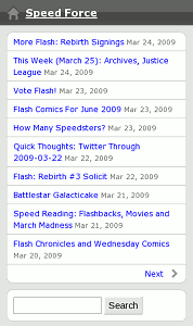
Mobile Site (WordPress Mobile Edition 3.0)

Anyway, if you have a web-capable phone, please give the site another look when you get a chance and let me know whether anything breaks!

In particular, I want to know:

  • What phone are you using?
  • Are you using the built-in web browser or an add-on like Opera Mini?
  • Can you view the site?
  • Does it look like the image above, or just like it does on your computer?
  • Can you make a comment?

If you can’t post a comment, please try one of the following:

  • Bring up the site on your computer to leave the comment.
  • Send me a Twitter direct message to @SpeedForceOrg.
  • Email me at speedforce – [at] – pobox – [dot] – com.

Thanks in advance!

Please Check This Site in Your Phone!

A quick request, if I may: If you have a web-capable cell phone, would you please try to view this blog in it and let me know how it appears? I’m testing some plugins that should optimize the page for desktop, low-end mobile, and high-end mobile devices.

Please look at the main page and at least one post, then leave a comment below (still on the phone if you can) with the following:

  • What phone are you using? (RAZR, iPhone, etc. Specific model if you know it)
  • Can you load the site at all? (If not, what error do you get?)
  • Does it look like..
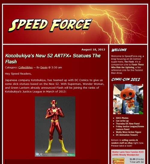
    1. The desktop version of the site (red background, lightning banner, full sidebar, complete posts on main page)
    2. A bare-bones page (plain background, mostly text, headlines only on main page, “Powered by WordPress. WordPress Mobile Edition” listed at the bottom of the page)
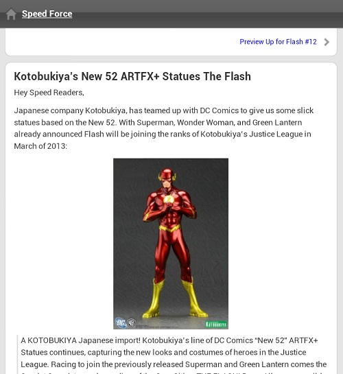
    3. A sleeker-looking list (grayish background, each post headline in a white rectangle, calendar image next to each headline, main page has headlines that expand to excerpts, dark red banner across top, “Powered by WordPress with WPtouch” listed in footer)
  • Are you using the built-in web browser, or something you installed (Opera Mini, for example)?
  • Did anything not work?

If you can’t post a comment, please try one of the following:

  • Bring up the site on your computer to leave the comment.
  • Send me a Twitter direct message to @SpeedForceOrg.
  • Email me at speedforce – [at] – pobox – [dot] – com.

I’m mainly trying to make sure that the detection code is working right, since I’ve got 3 different plugins (WPTouch, WordPress Mobile Edition and WP Super Cache) working together to manage it.

Thanks in advance!