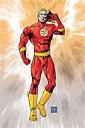
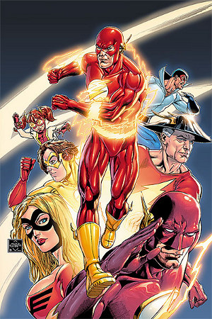
 Way back when DC first solicited Flash: Rebirth #6, they used a placeholder cover: Barry Allen in costume, taking his mask off, on a background of swirly colors. Artist Ethan Van Sciver mentioned around that time that all of the covers in solicitations for issues #4–6 had been altered to hide spoilers, and fans speculated that he would be surrounded by other speedsters in the final version.
DC has updated the listing for the issue with the final cover, and it’s completely different:
The variant cover was revealed two weeks ago. Flash: Rebirth #6 arrives in stores next week.


Pretty cool with four minor quibbles.
1. The old guy and the woman look completely static.
2. That’s an odd pose for Barry.
3. Barry looks much too muscular.
4. Does Jay’s helmet look odd to anyone else?
Iris looks adorable 🙂
“2. That’s an odd pose for Barry.”
He looks like he is getting ready to do the infinite mass punch.
Que dibujo mas feillo, si hasta parece de Liefeld
What Art More Failed
Is it just me or it looks like drawn by a 10 year old kid? no offense. and I’m still not buying Iris as Impulse. Why do they HAVE to fill the blank spots with the next one in line. I would rather love to see Bart bask as impulse and Iris as a new speedster.
Nice cover, though I’m still not thrilled with Jesse’s boobalicious look.
Completely agree. It seems unnecessary.
It’s also really impractical, because the way her top is drawn doesn’t seem to have much support. She’s going to jiggle around like crazy when she runs (which is really uncomfortable).
Jiggle around like crazy, huh? I wish this was a motion comic!
In the ~18 years since she first appeared, I don’t think anyone has designed a really good Jesse Quick costume. I liked the one in the Wonder Woman Plus JQ one-shot, but even that one had its problems (it was overly complicated, IMO).
Sometime I should write a post about the many costumes of Jesse Quick.
Yeah, I’m hoping for the variant on this one, that was an amazing piece! Glad with all the ‘make-overs’ Jay’s costume hasn’t changed!
.-= Dan’s latest blog post: QUENTIN TARANTINO 4 HAITI: Lost Art of Inglorious Basterds Goes Up For Sale =-.
Barry has horrible running form. You should never drive your arms across your body. It slows you down. If anyone should know this, Barry should.
I should’ve been more specific but this is exactly what I meant when I said it was an odd pose.
Who is that above Bart?
.-= Eric Ridgeway’s latest blog post: 2/10 comics =-.
Iris “Irey” West, the new Impulse.
Man this is such a horrible cover. I can’t think of the last time when I saw cover this bad.
Bart, Max and Irey look great, but everyone else looks a little….strange. Wallys face looks kinda funny…
Really, really bad… like Katatumbo said; looks like a Liefeld (shudder) cover. Ugh. Was never too happy with Van Sciver for Flash. His depiction of the characters is much too “severe.”
Yeah, so many things wrong. Wally’s face looks weird, Jesse’s breasts are too huge, Barry looks incredibly awkward, Jay’s helmet kinda looks like it’s floating, etc…
So yeah, variant cover for me.
Horrible cover.
I’ve been underwhelmed by EVS’s performance on this book. It’d be a bit pointless to criticize him more than what’s already been said, but this cover is really bad. None of the characters were properly drawn.
Wally’s pose looks awkward, and he looks too old. Jay’s neck muscles give you the idea that his Head should be pointing at a different place…
This really looks awful.
.-= Esteban Pedreros’s latest blog post: Batman contra el Escuadrón de Patos =-.
For some reason Wally’s cowl makes him seem older than Barry to me.
And Jay’s helmet makes me want Kung Pao Chicken.