Today’s guest post is the fourth in a series of interviews by Greg Elias on The Art of Speed.
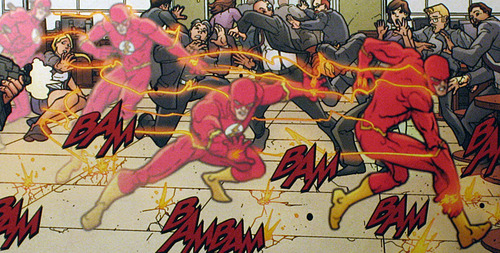
Between stints working the Gotham City beat with Robin, artist Freddie E. Williams II took his talents to Keystone City and the home of the young West family.
First teamed with Mark Waid, Williams hit his stride when Tom Peyer took over as writer. Ringing in a mind-bending new villain, the wrath of Grodd and the challenges of high-speed fatherhood, Williams and Peyer brought Flash from Keystone to Gorilla City and into the Speed Force.
In addition to his work on Robin, Williams has handled art duties on Seven Soldiers: Mister Miracle, Final Crisis Afterman: Run and JSA All-Stars. Though his time on Flash interiors ended with issue #246, he contributed the cover to issue #248.
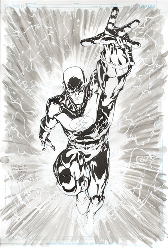
We spoke with Williams via email about his time on Flash, including the design of new villian Spin, the joy of gorillas and learning to love the lightning. He shared some of his techniques, as well as some original art!
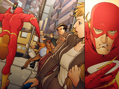
Q: One of the main themes of your run with Tom Peyer is the public’s distrust of Flash.
How did you portray that level of tension in the opening to issue #239?
FREDDIE E. WILLIAMS II: Right off the bat, the cover shows the people afraid of the Flash, fleeing in terror of him, which sets a good tone. Then on pages 1–3 the speed lines provide double duty, giving both motion as well as tension. In general, every person in the crowd looks uneasy, in fact, on pages 2-3 I have a lady clench her purse. They all just distrust him.
On a related note, many of the characters on the cover of 239, are modeled off of family and friends. It’s fun to incorporate hidden Easter eggs like that.
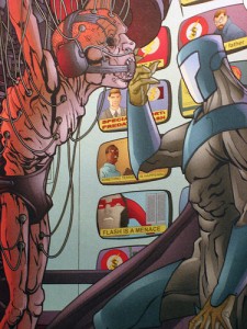
Q: Were you in charge of the design for Spin?
FW: Yup, I was in charge of that design. There was a written design, some abbreviated ideas from Tom Peyer, but one of them was so far out that it didn’t make it into the design.
Tom’s idea was that Spin’s helmet would actually be multiple faces in contortion, and always in writhing motion. I felt that would have been really confusing to the reader, unless we provided multiple close-up panels, in each of his appearances, showing the subtle difference in the moving faces, and wow, that would have been a nightmare to draw sequentially!
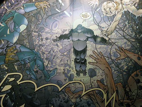
Q: Once Grodd enters the picture, the action gets ratcheted up a few degrees. What goes into creating a two-page spread like the shot of Grodd destroying Spin’s equipment?
FW: Thanks! It took a bunch of time, a lot of Adobe Photoshop Layers went into it 🙂 I’m a big fan of collateral damage, and psionics, so that spread was an opportunity to do both!
Q: What is your favorite (or most-used) method(s) of showing super-speed?
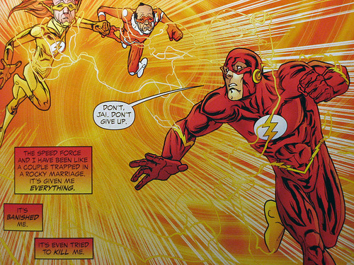
FW: I like to see lots of lightning, and I think it’s because of my own trial and error of drawing the Flash, in my earlier issues of flash I didn’t use as much lightning, and frankly the Flash looked slower… I then realized the reverse is true, adding more and more lightning, even if the Flash is standing still, makes him look like he is moving fast!
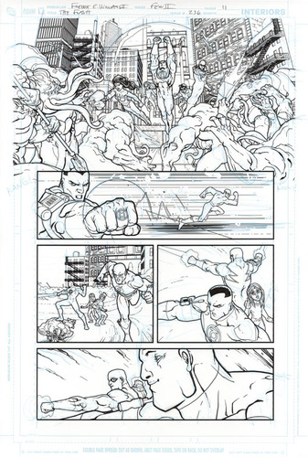
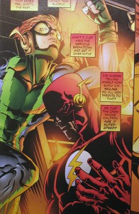
Q: The sequence where Wally retrieves Inertia from the burning Flash Museum is one of the emotional high points of the story. What was involved in to putting that together, with regards to pacing and matching the weight of the monologue?
FW: In issues leading up to that one, I was under an art direction to do more of an open line art, almost cell shading (animation) type style, leaving all of the shadow and texture open to coloring, which can sometimes have the tendency to make the artwork flatten out. This was the first issue I was really given permission to use shadow and texture the way I was used to… so it was good timing, adding all the spot black shadow helped to add an emotional weight needed in those scenes.
Q: You illustrated one of the more visceral Speed Force scenes in issue #243.
How did you come up with your take on this concept, which is rarely shown in a physical form?
FW: If memory serves correct, I think Tom Peyer wrote what it should look like, with swirls of energy and stuff… so mainly I just tried to go with his description, and in general make it feel psychedelic! I drew a bunch of motion lines in Photoshop, then used some distortion filters to make them more wavy, then provided those to the colorists on a layer by themselves.
Q: The latter part of your run featured a lot of Gorilla City and its inhabitants.
How did you come to your version of the hidden city and the overall look of the Gorilla population?
FW: First off, I love drawing Gorillas! In fact I think there may be a rule that states all comic book artists love drawing gorillas! I think I just tried to give Gorilla City a Roman plus high-tech feel to it, just tried to make it look lavish.
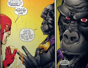
Q: What challenges come into play when using animal facial structure to portray human expressions and mannerisms?
FW: The challenge comes in, how much do you humanize the face. Gorillas resemble humans quite a bit already (as compared to cats or dogs etc.) so some of the work is done there, but there is a risk of making them look so human they look more like a sasquatch, instead of a humanized gorilla.
Q: How has your time on Flash influenced your work for DC since you left the title?
FW: It’s affected my commissions quite a bit, I get lots of requests for Flash when I’m doing commissions at conventions. I really like that because the looseness / energy of drawing the Flash is quite fun!
Q: What are some of the key differences between drawing a “street-level” book like Robin, and a book such as Flash where the main character’s power defines the pacing and characterizations in the book?
FW: As dynamic of a character Robin is, he’s still just human, so there is a difference in the thinking of his body language, or how an opponent reacts when he is struck, or even the way he might look in a fight scene. The difference is a tough one to put in words, but a noticeable one, when think of layouts or poses.
Oh, another big difference comparing Robin to the Flash, you save quite a bit more ink when drawing the Flash 🙂
Q: What is your favorite speed trick of all time?
FW: I love the trick of vibration to become intangible, to pass through solid objects! Such a cool trick!

I wasn’t a big fan of the story, but definitely enjoyed Freddie’s art. Especially those covers.
Ditto. I hated the story, but enjoyed the artwork.