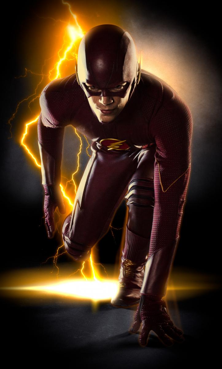
DC has released the first full image of Grant Gustin in the Flash suit. (We got to see a preview of just the mask two weeks ago.)
First thoughts:
- Wow!
- It does look a little dark, but again that’s partly backlighting.
- The earpieces are raised ever so slightly. It’ll take a bit of getting used to, but I think it works.
- While I prefer the white circle around the chest symbol, I think the brighter red on a darker red background works better for the universe established by Arrow.
- I wonder what the belt looks like.
The pilot episode is currently filming.
The Flash’s costume was designed by three-time Oscar® winner Colleen Atwood, who also designed the costume for Arrow and whose motion picture credits include Academy Awards® for her work on Alice in Wonderland, Memoirs of a Geisha and Chicago, as well as seven additional Oscar® nominations for films such as Snow White and the Huntsman, Sweeney Todd: The Demon Barber of Fleet Street and Sleepy Hollow, among others.
So, Speed Readers…what do you think?
UPDATED Wednesday! More photos from Tuesday’s on-location shoot have surfaced, showing the costume in daylight. The Daily Mail has a good round-up (Thanks to Veronicadiall for the link in the comments below).
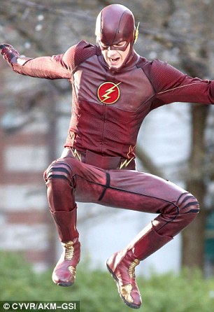
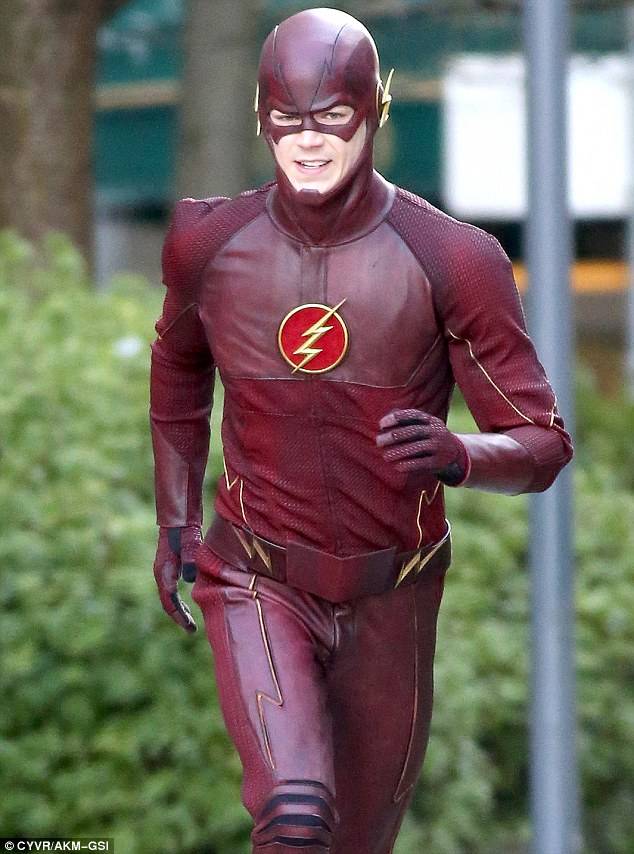
I’ll admit to being a bit less enthused, particularly over the lackluster belt design. I don’t have a problem with the overall look. My wife suggested it looks a bit like an athletic suit, which makes sense for a runner. The earpieces work best when you can see a three-quarter profile. I agree with Devin “The Flash” Johnson that it’s nice that this costume looks like one he can move in. The yellow piping works better in live-action than on the page or in animation (I thought it looked awful at the end of The Flashpoint Paradox).
I find it interesting that I actually like details like texture in a live-action version of the costume, but prefer a hand-drawn version to be sleek and uncluttered.
I’m still warming up to it, but considering that we’re looking at…
- A daytime location shoot, meaning they have less control over lighting.
- Opportunistic shots by bystanders who don’t have as much control over camera angles as the on-set cameras do.
- Still frames of scenes when the Flash is intended to be seen in motion, or behind-the-scenes moments.
- Raw images, with no post-processing or special effects.
…I think the jury’s still out.
How about you? What do you think of it now that you’ve seen more photos of the costume?
I think its the best way to adapt it for todays TV audience, While it fits in the Arrow world still stands on its own while honoring the Flash costume as a whole! Absolutely love it!
LOVE it.
Love it! Can’t wait!
I love it 🙂
Red boots, kind of a nod to the old series. Personally I prefer a white circle, but over all awesome.
is this a spin-off from Arrow ??
I like it. It looks great!
This looks fantastic. I can’t wait!
I’d like to see it in better lighting, in full (what, no belt area?), and in motion before I render my judgement.
The suit looks good. It’s the “realistic and grounded” era and sadly we comic book fans have to make some compromises as long as these characters reach a massive audience without being labelled as silly. So, changes have to be made.
Still, is better than I expected. Overall it’s a sober and simple enough design.
Phil Boilard, look closer. The shoes are gold. They just don’t have boot-style tops…which is probably better for running!
Tim Ananda, yes, this is a spinoff from Arrow. Grant Gustin appeared as a pre-lightning Barry Allen on two episodes last December. The pilot episode is shooting right now, and if picked up the series will launch this fall.
yeah, I thought that I saw a segment with the chemicals and some power-surge event.
but NOT the Flash from “Smallville”.
things getting interesting at The CW
Ohhhhhhh. Didnt notice w/the dark lighting. Now I don’t like it. ‘Sneakers’ on tights looks weird.
Wait, I save the image and zoomed in, the gold is the glow of the lightning, dem boots is red.
There are lil gold ridged bits, but over all red.
Looks great! And to think, some people didn’t think Flash wouldn’t have his emblem. I like the updated emblem. It classic, but fresh feel to it.
Phil Boilard Hmm, you may be right there. It’s hard to tell for sure, but it could be a break between shiny red leather and non-shiny red fabric, rather than gold and red.
It’s…okay. I still prefer the wingtips as earpieces over lighting bolts and I wish the Flash emblem had a yellow background than a red one but I suppose I’ll get used to it. What I like about it is that it’s much sleekier (less bulky, no stuffing) than the costume John Wesley Shipp wore in the original Flash TV series. Suits a guy who runs a lot. Hopefully we’ll get to see it in action soon. Fingers crossed this gets picked up as a series and we get to see some Rogues in costume as well.
Looks great! I love it.
I want to see this suit in action.
How does it look from 0-Mach1?
Here you go…
Looks terrific. Love it!
It seems to be like Arrow costume style. But it’s not suitable with the Flash. Look so thin and weak.
I give the suit a 5.5, maybe a 6 out of 10. They CW’d him a good bit, here’s what needs fixed: 1.) Needs the white behind the logo instead of red, also the lightning bolts should be symmetrical instead of the bottom end being shorter than the top part. 2.) Needs the right ear pieces like how Ethan Van Sciver draws them as seen below: https://texcap.files.wordpress.com/2008/09/flash_van-sciver_3f1.jpg 3.) Needs the gold lightning trim on the forearm area of the costume and the waist/”belt” area. 4.) Although I’d love to see the gold boots, I know CW doesn’t have the balls for that, so gold lightning trim on the top of The Flash’s boots right where they meet below his knees would be ideal. 5.) Suit should look less busy, and that bigass belt buckle NEEDS to go. 6.) Make the “red” areas on the suit crimson/scarlet instead of burgundy. Other than that the rest is fine. I really hope this suit is just the Mark 1 and we will see some big improvements in later episodes, there’s definitely room for them. Oh and the chin strap doesn’t bug me too much, I think it’s stupid but I can take or leave it.
The belt is a fail. I’m saddened.
If I’m lucky, maybe this is the pilot suit only, and it’ll change for the actual series…
Ok, now I’m getting excited. It looks pretty freak’n awesome.
I’m okay with the design (at least as far as I can see the design given his hunched over pose) but not sure I like it as a The Flash costume until I do see all of it. Already dissatisfied with the small, flat ear pieces.
One thing: the red of the chest icon made me grimace a bit at first sight. It looks okay in and of itself, but….didn’t the white circle mean something to original DC Barry? Red there just gives me a sinister vibe same as it did with DC52 Bart’s eye lenses and the red ‘bird’ on DC52 Nightwing. Not a fatal dislike…just…disturbing to me.
I like the new suit. I can’t wait for the show so we can see Mr. Gustin in action.
Here you go:
http://www.dailymail.co.uk/tvshowbiz/article-2578617/First-photo-Grant-Gustin-costume-The-Flash-new-TV-series-revealed.html
“Turribole”
I had to come by to see what the more hardcore fans thought. I’m kind of shocked – by the design and the positive reaction, here.
Needs more yellow (boots at least) and the red background on the logo needs to get lost. Otherwise, it’s a good “practical” take on the iconic costume.
Needs more noticeable yellow. Bolts on the belt are too thin, and he needs bolts at the top of his boots and on his sleeves
Other than that, I think it’s pretty darn good.
Reminds me of a cross between Bart Allen in Smallville and Ben Affleck’s Daredevil costume. It should be a brighter red, with a white background for the emblem. The rest I could work with. We’ll see how it looks when it (hopefully) hits the screen.
The UPDATE picture:
I saw the buckle and my first thought was “Reading is fundamental.” I kid you not. It looks like an open book. Definitely not what I pictured The Flash using to hold his trousers up. Speaking of which….eh. The boots? Needs more yellow. Dislike the traction look on top of the foot. Double eh on the plethora of red. Okay, it’s not horrible by any stretch and I’d take it over the monstrosity of fake muscles that was Flash 1990’s, but….yeah. Not terribly excited.
Also, i do hope that they are filming in a cool to cold climate. That thing looks like an invitation to heat stroke if worn anywhere where it is warm.
I expect it’s much cooler than the foam rubber suit from the 1990 show. IIRC that one had tubes in it that they could pour water into between takes for cooling off. (Or I may be getting it mixed up with some other costume.)
Also: Vancouver.
Good thing. Let’s hope for the actor’s sake that The Flash never needs to visit the American Southwest Deserts any time between March and November or its the Scarlet Speedster who will be the murder victim. Down here, Captain Cold would have to be renamed Captain Melted or Captain Steam Bath. 🙂
“Down here, Captain Cold would have to be renamed Captain Melted or Captain Steam Bath.”
Either that, or he’d be very popular at outdoor events.
“How can we make sure the fair is bearable this year?”
“Put a diamond exhibit right in the middle of it. Captain Cold will be sure to show up and steal it.”
THIS is what The Flash costume should look like, hopefully it evolves into something like this over the course of the show:
http://fc03.deviantart.net/fs70/f/2013/362/7/b/grant_gustin_the_flash_03_by_christopher_nico_by_orangeasgard-d6zua14.jpg
Now that is a Flash costume.
The TV show one does look rather home-made cobbled together. Maybe as time goes on “Barry” will realize it’s not as streamlined as it could be and (heh) lighten up.
Ech….Im not a fan of it at all. Could be worse I suppose…
Its nice to see that the wings on the mask do come out a little bit though.
Is it perfect? No, but its not terrible. I’m so excited to see flash in live action I’ll take it! The belt is weak and where are the YELLOW boots?!?!?! I dont recall seeing the red inside the symbol but i think it works.
The Mary Sue is running some pieces on the history of The Flash (all of them) and their costumes. Part 1 is up now: http://www.themarysue.com/the-flash-costume-history/
Nice to see the old Agent of S.T.Y.L.E. columns back online! I think this might even be updated, too. I don’t remember, for instance, the G.I. version of Jay’s outfit.
It’s alright. I don’t like the New 52 inspired cowl design nor do I like the logo.