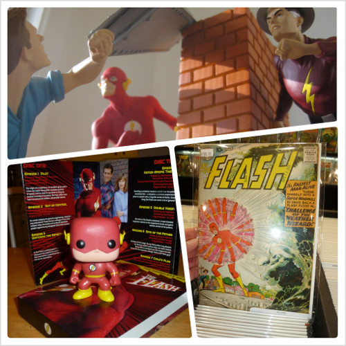
I finally updated the look of the site! It’s been basically unchanged aside from tweaks here and there since the launch back in 2008. 😱 The narrow columns, the small font, and the white-on-dark-red text have been bothering me for a while, as has the fact that the mobile theme, which worked great for phones, was terrible on tablets.
The main problem: I could never find a theme I really liked, and I just haven’t had time to build one on my own.
I finally ended up going with one of WordPress’s older default themes, Twenty Twelve, which I still use on my personal blog. It’s still old, but not as old, it adjusts to different screen sizes, and it’s a lot cleaner (and easier to read!) than what I had before.
If you run into any problems, please let me know here in the comments, on Twitter at @SpeedForceOrg, or by emailing speedforce – at – pobox – dot – com.
Update: Strangely, Chrome on my Android phone is shrinking the whole layout like it thinks it needs to shrink a desktop site. Fortunately it’s zoomable to readable size, bit it shouldn’t be doing this to begin with. I’ve got 2 other sites using the same theme that work just fine on my phone. Firefox doesn’t have a problem with it either. But it’s 1:30 am and I need to get up for work tomorrow, so it’s time to sleep & I’ll solve the issue later. Update: Found the problem. It was one of the items in the sidebar, oddly enough.
Update: Fixed displaying all authors on multi-author posts.


